The Seattle Tilth Website Analysis proposal outlines all the steps of our usability test methodology. We began by describing a number of user personas and then went on to outline the testing we would undertake to determine how well Seattle Tilth’s site served their goals. There are brief descriptions of competitive and heuristic analyses, card sorting, and a usability test. The idea was to help the client understand the different parts of the test and why they are essential to their understanding of the website's performance.
For our UX Research Methods team, we created a case study in which we wanted to analyze a local Pacific Northwest non-profit website that had a significant amount of traffic, but also seemed to have numerous usability problems. We chose Seattle Tilth. Seattle Tilth provides information and activities reaching out to promote organic gardening for food and plants. They offer many classes and events to further their mission.
Proposal
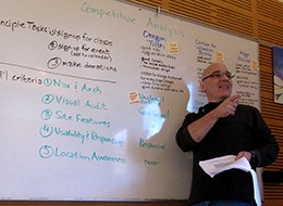
Competitive Analysis
As a non-profit, Seattle Tilth has certain functions that determine whether they adequately serve their public, and by extension, survive. We narrowed our testing focus to three operations that were critical to Seattle Tilth’s revenue stream. The first one was to test how easy it was to find out information about classes, events, and programs. Following that, how simple was it to sign up for any of these? The final test was how well the site design facilitated making donations. We chose two other non-profits in the region to compare and contrast both their visual approach and their functionalities in the light of these three criteria.
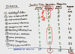
Heuristic Analysis
By definition, a heuristic test is a method for discovery that may not be perfect, but satisfies the goals at hand. This analysis applied Jakob Nielsen’s ten heuristic principles to the visual and functional design of the Seattle Tilth site. We determined typical user pathways through our three critical operations and analyzed them using thee ten new criteria. We then performed a high-level evaluation of each operation, followed by a more granular grading system. By quantifying the test data, we were able to more clearly understand the shortcomings of the site’s performance.
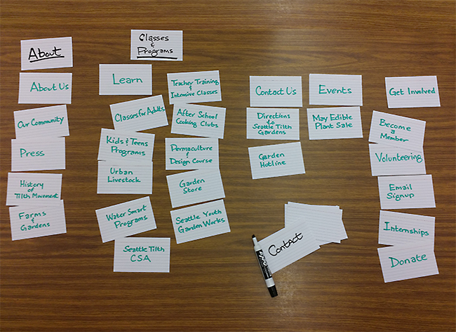
Card Sort
The navigation on the test site was a particular issue that came up whenever the design was discussed. As is common in many sites, it had a random quality to it that is the mark of many sets of hands. Our team could untangle it, but we wanted a navigation scheme that spoke to as many users as possible. It was time to bring in the card sort, where test participants sort out the navigation terms in ways that make sense to them. An online test was performed over a few days and we compiled the data into a number of charts and graphs that clearly guided us to a solution.
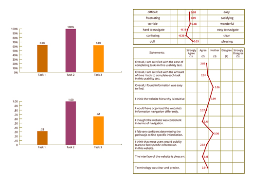
Usability Test Plan & Report
Concerns arose throughout the test stages that kept bringing us back to usability issues that placed obstacles in the path of our essential site functions. Our team had to get some real-world feedback on how bad these roadblocks really were. So we developed a test plan with user scenarios that would set the test participants to work on our three primary functions. This would help us honestly identify the issues that adversely affected user performance. We then evaluated the results, and developed conclusions about the data, and what it told us about the typical user experience. Our test report outlined design recommendations which emerged from these test conclusions.
