UX Case Study
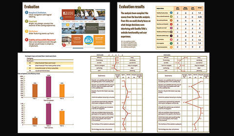
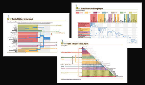
Client: Seattle Tilth UX Research Methods Project
Tools: Photoshop, Illustrator, PowerPoint, Screaming Frog, OptimalSort, Word, Excel
Team: Michelle Szwedo, Cameron Kunz, Jeff Reynolds
My Role: Writer, Designer, Test Designer, Test Moderator
The Challenge: A long-established local institution devoted to sustainable gardens promoting local food growth and nutrition has an underused website. Most of its activity has migrated to its Facebook page. What can be done to make the website a vital part of its home-grown community?
The Solution: Our team did a 12-week UX analysis of the Seattle Tilth site. We created user personas, heuristic and competitive analyses, usability tests, and card sorting. Results were detailed in presentations and reports.
Comments: I loved this entire process. It was fascinating to delve into how the design affected the functionality, and how testing consensus would hone the navigation. I love testing because it is always a source of surprises.
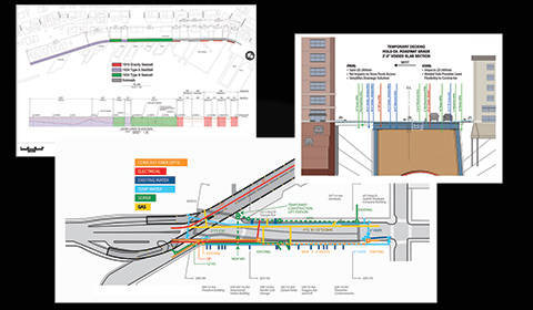
Seattle Public Projects Informational Graphics
Client: KPFF Consulting Engineers, Seattle
Tools: Photoshop, Illustrator, AutoCAD, SketchUp, Google Earth
My Role: Researcher, Graphic Designer, Technical Illustrator, Structural Designer
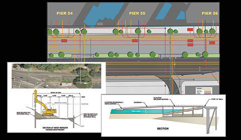
The Challenge: Conveying complex technical information and concepts to stake-holders and the public for various large municipal projects in the Seattle area.
The Solution: By employing clear color schemes and clarifying the relationship between existing and proposed (new) elements, I attempted to simplify the design and construction impacts for project proposals, reports, and presentations.
Comments: These information graphics are from some of the big projects that are happening in Seattle right now. I had the privilege to work on a number of these in the preliminary stages. The seawall, the tunnel, and floating bridges. This is one of my passions: to clarify complex technical information in such a way that stake-holders and the public understand the processes involved.
Web Design
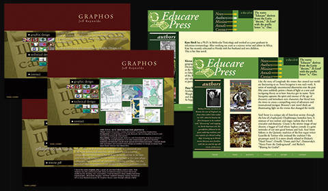
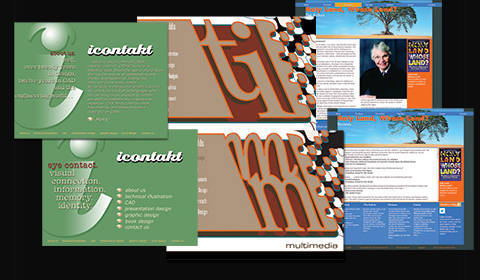
Client: ikontakt, Educare Press, Fairhurst Press, and myself
Tools: Photoshop, Illustrator
My Role: Web Designer, Copywriter
The Challenge: These various entities needed sites that told their stories in ways that engaged users in order to promote their products and services.
The Solution: These designs were as much a product of interviews as sketches. I always get as much detail on the feelings and motivations of clients as I can, and how they envision their customers
Comments: Way before UX came along as a ubiquitous term, I was taught to always figure out who the end user is and to mentally occupy that role when designing. I always do detailed interviews with clients to see how they view their relationship with their customers.
Therapeutic Health Services Website Re-design
Client: Therapeutic Health Services
Tools: Photoshop, Illustrator, Axure RP, Screaming Frog, Google Analytics, WordPress, Word, Excel
My Role: UX Researcher, UX Designer, Web Designer, Assistant Editor
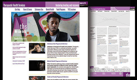
The Challenge: The old website got little traffic. The navigation was confusing. Information about programs was hard to find. The marketing director wanted a clean design, with easy access to clear information, and naturally wanted to use the website to generate more business.
The Solution: The first thing was to establish who the users were. Analysis showed there were three distinct user groups. Providing the users with the clearest path to the information they needed was the key. Presenting a clean design promoted THS’s experience and expertise. I designed the new site around clear pathways for each group with respective information arranged accordingly. Other features were added to facilitate user’s easy access to services.
Comments: Empathy and discarding assumptions about who accesses these services seemed key to creating a successful design that signaled to users that we earnestly wanted to connect with them. I did not in any way want to make assumptions, and I think the care I spent in selecting images was very effective. The rest of the site almost designed itself, as sometimes happens with good UX data. I kept to a color scheme dictated by their logo and introduced lots of white space. All this has resulted in and over 1200% increase in traffic with a bounce rate cut to less than half.
Holy Land, Whose Land? Book and eBook Design
Client: Educare Press, Fairhurst Press
Tools: Photoshop, Illustrator, InDesign
Team: Richard Bines of Kerntiff Publishing Systems, Jeff Reynolds
My Role: Book Designer, Assistant Editor, eBook Designer, Project Manager
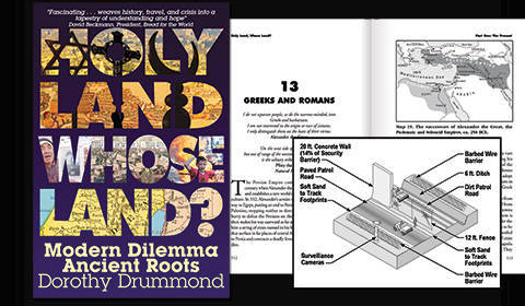
The Challenge: The aim of the book was to demonstrate the fact that many peoples through recorded history have lived in the land we call Israel. The end point of the book was that diverse groups should be able to live there now. The potentially controversial nature of the book presented a unique design challenge. I aligned purposes with the author, both of us wanting to present the history in a subtle way that allowed the reader to reach their own conclusions.
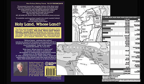
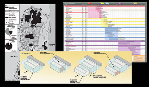
The Solution: The cover had to catch the eye, with imagery that was selected very carefully. Once that was accomplished the rest of the book was designed to let the information flow organically. The maps served to augment the text, of course, but took on their own parallel visual narrative that successive civilizations had inhabited the land.
Comments: The maps were like a big illustration job inside a book design project. But I love the way the maps make the point. The infographic nature of the charts I created were designed to show data in revealing combinations that tell a story that separate statistics might not convey. Converting it into an eBook was a huge challenge, transforming the book into a giant HTML/CSS document. I collaborated with a developer in the UK to create one of the first eBooks with a fully functional index. Getting the index to work was particularly satisfying.
Exhibit Guides
Client: Internal use only.
Tools: Photoshop, Illustrator, PowerPoint
My Role: Graphic Designer, Researcher
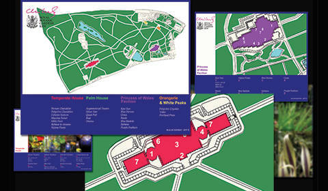
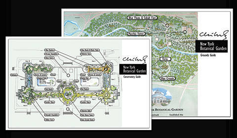
The Challenge: Similar to an executive summary, these guides were designed to assist higher level company executives to find their way around the exhibits.
The Solution: In the case of the Kew exhibit, I developed a simple map based on old engraved maps. I stuck with primary colors to code each area differently. This was coordinated with a PowerPoint presentation that also featured photos of the glass works. The New York Botanical Gardens exhibit was a last-minute design. Thinking fast, I used existing watercolor maps the Gardens for the backgrounds, tweaked them to remove extraneous details, and added the callouts for each exhibit element.
Comments: These are designs for in-house guides for botanical garden exhibits for a world-renowned glass blowing business is Seattle . . yes, that one. These were fun, fast-track projects.
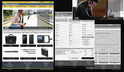
E-Commerce Case Study
Client: eCommerce Advanced Web Design and UX School Project
Tools: Photoshop, Illustrator, InDesign, Word, Excel
My Role: Researcher, Graphic Designer, UX/UI Designer, Web Designer, Project Manager
The Challenge: The challenge was to advance our web design capabilities by developing our own eCommerce website. Assignments took the form of realistic project waypoints and documentation from initial research to a finished site.
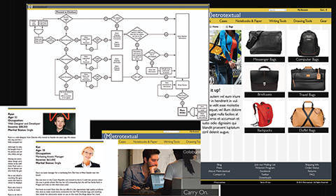
The Solution: I began by researching eCommerce sites to understand common functionality and structure. I felt project elements had to be sequenced like they would be in real life, so I started with creating my own retail concept complete with name, logo, and other visual elements. Then I began to develop the web portion of the project. I started with creating user personas, functional specs, and IA based on relevant pathways I analyzed in my research. All this gave me clear direction to proceed to the visual designs and the website itself.
Comments: I created I site I would want to visit. existing sites. Keeping in mind the users (…well, me, actually), I envisioned a site that designers would love to shop at and talk about, a place where you could keep up with the latest cool gear. Curating all the products took many long nights, but I love how the whole project came together.
Presentation Graphics
Client: Various
Tools: Photoshop, Illustrator, PowerPoint, AfterEffects, SketchUp
My Role: Graphic Designer, Researcher, Editor
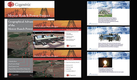
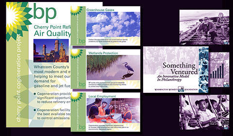
The Challenge: These presentations contained a lot of technical or financial information that needed clarification and some creative and attractive way to explain power generating processes or fund-raising concepts in an easy to grasp visual.
The Solution: I have so many presentations over the years it’s hard to keep count. I typically research the topic and discuss the fine points as much as possible with the client. I follow that with asking what most important part of the client’s story they want told, as well the parts that are easiest to misunderstand. Then I build my presentation around these two parameters.
Comments: I live in dread of having to watch too many PowerPoint presentations, so I try to focus on the storytelling and good images. I avoid too many charts, and usually turn to graphs and diagrams and concise text to convey ideas and establish data relationships. I think a good diagram can illuminate a concept better than almost anything else. But I think good images can convey emotion, which is the key to memory retention.
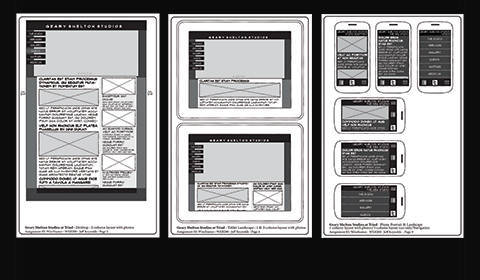
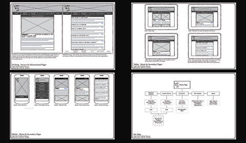
Wireframes
Client: Various
Tools: Illustrator, Axure, AdobeXD, Photoshop
My Role: UX/UI Designer
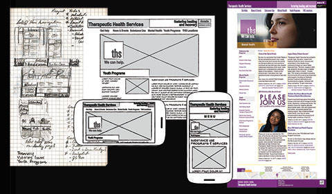
The Challenge: The idea, of course, is to provide a schematic of a website. The challenge is to illustrate the idea or objective structurally, without getting too tied up in the visual elements. Like setting the table before the food gets here.
The Solution: The balance is to have enough detail that the layout is clear, but not so much that it doesn’t allow for the natural evolution of a design. With a highly iterative process, however, newer, more fluid prototyping apps are convenient since you can crank out versions and different pages quickly. Functionality and transitions have always been so hard to convey to clients who often have difficulty visualizing some visual concept we are trying to get across, but with modern prototyping apps, that problem has been solved.
Comments: I love me some wireframes! They bring you to the place where the design starts to become real. I like to use pencil and paper at first, and then progress to Illustrator, Axure, or AdobeXD. I enjoy laying these out, like drafting for websites. They are fun to do and provide so much direction over the course of a web project. It’s incredibly effective that carefully analyzing how the different UI elements will perform at this stage can eliminate so many future problems
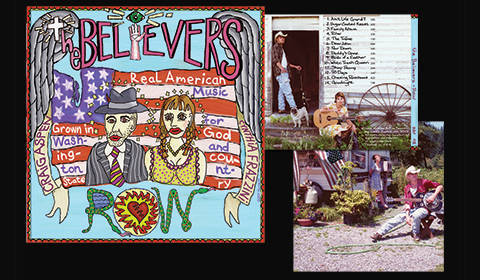
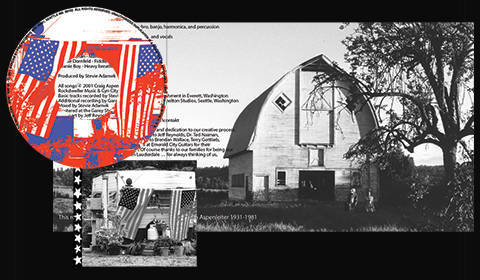
The Believers CD Cover
Client: The Believers
Tools: Photoshop, Illustrator, Painter
My Role: Graphic Designer, Illustrator, Photographer, Editor
The Challenge: This project wasn’t so much about creating a CD cover, but more telling a story or evoking emotions surrounding connection to the land, relationships, a simpler time and a slower pace. The group identified with the alt-country scene and wanted to demonstrate that connection.
The Solution: After listening to the group practice, and getting advance rushes of their recordings, we began to discuss the emotional and geographical content in their music. For the cover illustration they wanted a design that spoke of folk art and hand-painted signage. The sound certainly evokes elements of The South, but the budget kept us in the Northwest. They didn’t have a photographer, so I got out my gear and started shooting. We took trips out in the country and found shot locations that worked with the theme. Thankfully it was summer and we had some sun.
Comments: I think every graphic designer wants to do band graphics. I was lucky to connect with The Believers, who are a really great alt-country Americana duo who started in Seattle. We began with an illustrated cover design and then the project expanded until I ended up doing all the photography. Later I was called in to design their poster graphics and fliers. This was such a wonderful project.
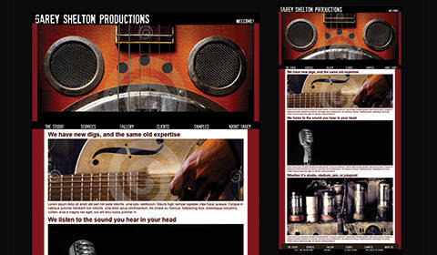
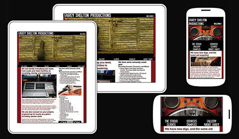
Recording Studio Website
Client: Garey Shelton Productions
Tools: Photoshop, Illustrator
My Role: UX/UI Designer, Web Designer
The Challenge: The project brief was to create a new website for an established recording studio run by a Grammy-winning producer. The website launch was to coincide with the opening of a state-of-the-art new studio and display the new location and all the amenities.
The Solution: Since the clients of the studio would most likely be musicians recording new songs, I decided to take the approach similar to album cover art, with a rough and retro feel. The primary imagery focuses on iconic instruments and equipment that musicians use, and then the second-level images are more about the studio. This layering employed older musical images that hinted at the breadth of Garey’s recording experience.
Comments: After a long graphic design career, this was my first web design with a real client. The website design and implementation went very smoothly. The client loved the rough-hewn design and the imagery. Unfortunately, the construction of the new studio was never completed. The fate of the website is still uncertain.
Book Design
Client: Educare Press, Fairhurst Press
Tools: Photoshop, Illustrator, InDesign
My Role: Art Director, Graphic Designer, Book Designer, Assistant Editor, Photographer, Illustrator
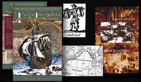
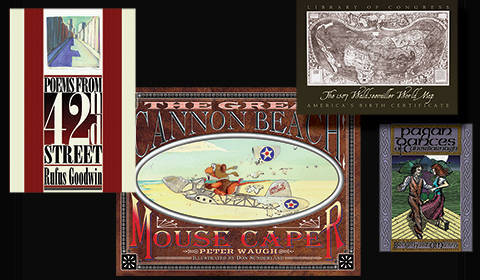
The Challenge: As Art Director, I was tasked with designing covers and books, and promotional materials. We produced a diverse range of book types: novels, poetry, a textbook, books on history, and a children’s book. We pitched a few books to other publishers, so I designed and assembled mockups. I also represented the publisher at national and international publishing trade shows.
The Solution: Designing a book cover is all about generating curiosity while telling a small slice of the story inside. A story about a homeless man got me out in the streets, capturing images of their broken environment. A history of one person’s voyage in the Age of Exploration had me researching old maps and engravings. The demands were always different and led to visually stimulating adventures. Crafting the interior of a book is almost like a website, developing the architecture, and then designing visual elements relating to the theme. While working closely with authors, I assisted in editing some of these projects. I also represented the publisher at national and international publishing trade shows.
Comments: There are few things I love as much as books, and designing them is a wonderful thing. I enjoy jobs that require many hats, giving me the opportunity to create ancient and modern maps, some technical illustrations and photographs.
Javascript Zoo
Client: Personal Project
Tools: Photoshop, Illustrator, Painter
My Role: Graphic Designer, Coding
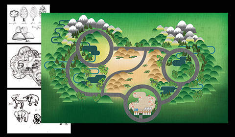
The Challenge: This is an on-going project I started recently to help develop my JavaScript and jQuery skills, which has also morphed into a design project. I wanted to develop something that was like an interactive map which would naturally generate ideas for fun new features I could add in.
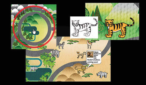
The Solution: I created an app for kids to interactively explore an imaginary zoo. To start, I created an illustrated map of the zoo, with circles that appear on hover to zoom into different areas where you see the animals and get information about them. I designed the landscape with different environments, Africa, Asia, and The Americas, populated with animals indigenous to each. Then started to add JavaScript functionality a little at a time.
Comments: I am not a great coder, but projects like this keep me at least aware of what is possible. When I see a feature I like on a website, I will check out the code. As a designer, I feel I need to have a basic understanding of what I am asking others to develop.
Good Road Network UX Testing
Client: Good Road Network
Tools: Photoshop, Illustrator, InDesign
Team: David Wall, Dorie Lincoln, Chris Moreno, Jeff Reynolds
My Role: UX Test Moderator, Interviewer, Test Observer, Copywriter
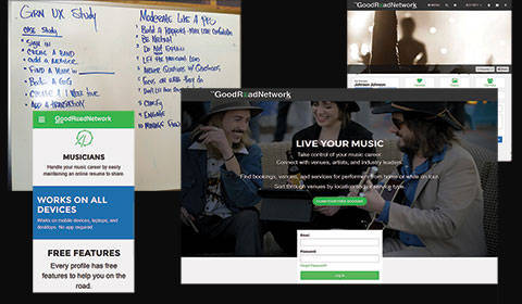
The Challenge: We were asked to help out David Wall with UX testing of his site in development. Good Road Network is like a LinkedIn for musicians and bands to connect and to book gigs locally and nationally. Before the formal testing, information was gathered as we encouraged musicians to explore other areas of the site and to book imaginary tours up and down the West Coast. The sign-up process for musicians was the specific portion of the site we were testing.
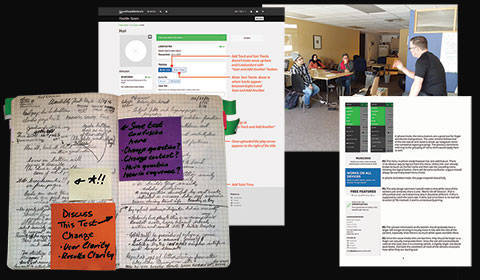
The Solution: We began by taking notes while watching the exploratory session over a few days. These sessions revealed a lot about the site. There were quite a few areas of that had interface issues. Once in the testing we all observed and took notes. This also served to orient us to the particular testing process we were focusing on. After notetaking we acted as test monitors. At the end of each day we discussed the issues that came up in all the sessions. Sessions took place over two weekends. After all the testing was done I wrote a report of my findings based on my notes.
Comments: I really like testing. It is an experiment. You get real-time reactions and can change things right away based on real data, and not just some hunch. This is the thing about UX that I like the most: for years in print work there was talk about designing for users, but the method was imaginary. We basically guessed what types of users would want. I love that now we are getting real responses and designing from live data. It makes design so much more alive.
Non-Profit Case Study
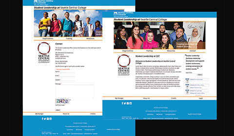
Client: Seattle Central College Student Leadership
Tools: Photoshop, Illustrator
Team: Developer: Michael Cody, Designers: Katy Anderson, Jeff Reynolds
My Role: Team Lead, Web Designer
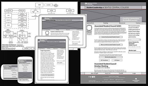
The Challenge: The assignment for the team was to design and develop a WordPress site for a local non-profit. We had two designers and two developers. We were tasked with all the usual steps, meetings with our client, writing a proposal, developing information architecture and wireframes, and creating visual designs.
The Solution: I was one of the designers. I served as lead on the team so I had most of the client contact. The front end of our timeline was evenly loaded between design and development. But then one of the developers dropped out, which destroyed our schedule. So, we had to come up with alternate plans and assignments on a regular basis. I was grateful that the other developer was a rock star. We were able to regroup and the team dynamics were really supportive and efficient.
Comments: It is a different thing to design in a team. In some ways it is so much easier, simply because of the shared work. But the coordination of the work is always a bit of a challenge. I enjoyed working with the developers and we had a good rapport based on respect and appreciation for different skill sets. The client was very happy with our design solutions and the excellent development.
Information Graphics
Client: Various
Tools: Photoshop, Illustrator, SketchUp
My Role: Graphic Designer, Researcher
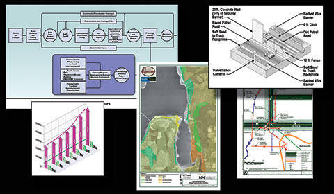
The Challenge: The idea for all these projects was to compile a lot of technical information into images that tell the story quickly. I try to get as much of that story into each one as I can by layering information or demonstrating sequencing.
The Solution: I usually sketch out a lot of iterations during the design process and see what strikes me as the clearest. Then I get into the color scheme since color translates to categories and differentiation of objects. I take special care to try and establish data interrelationships to spur connection and memory.
Comments: When I am designing these my natural curiosity starts to take over and I begin to ask questions about the process or concept I am dealing with. How much of the process can we show in each stage or should we isolate stages? Are there other aspects we can illustrate that take this deeper?

